A metal building gives you four color surfaces: roof, walls, trim, and wainscot. How you combine them is most of what determines whether the finished building reads as intentional or industrial. It costs the same either way, which makes this the highest-return decision in the whole order.
The Four Surfaces
Roof. The largest visible surface from a distance and from any elevated view. It also drives heat gain — see best colors by climate.
Walls. The dominant color up close. Usually the lightest of your choices, since large dark walls read heavy.
Trim. Corners, eaves, door and window surrounds, and the ridge. Small in area, disproportionate in effect. Trim is what makes edges look finished rather than cut.
Wainscot. A different color on the lower few feet of wall. Optional, inexpensive, and the single most effective way to break up a tall blank wall.
Combinations That Work
Match the house roof. Take your home's roof color for the building's roof, a neutral for the walls, and the house trim color for the building trim. This is the highest-success approach when the building is visible from the house or the road, and it's what we'd recommend to most residential buyers.
Dark roof, light walls, dark trim. Classic and forgiving. The dark roof grounds the building, light walls keep it from looking bulky, and matching trim ties it together.
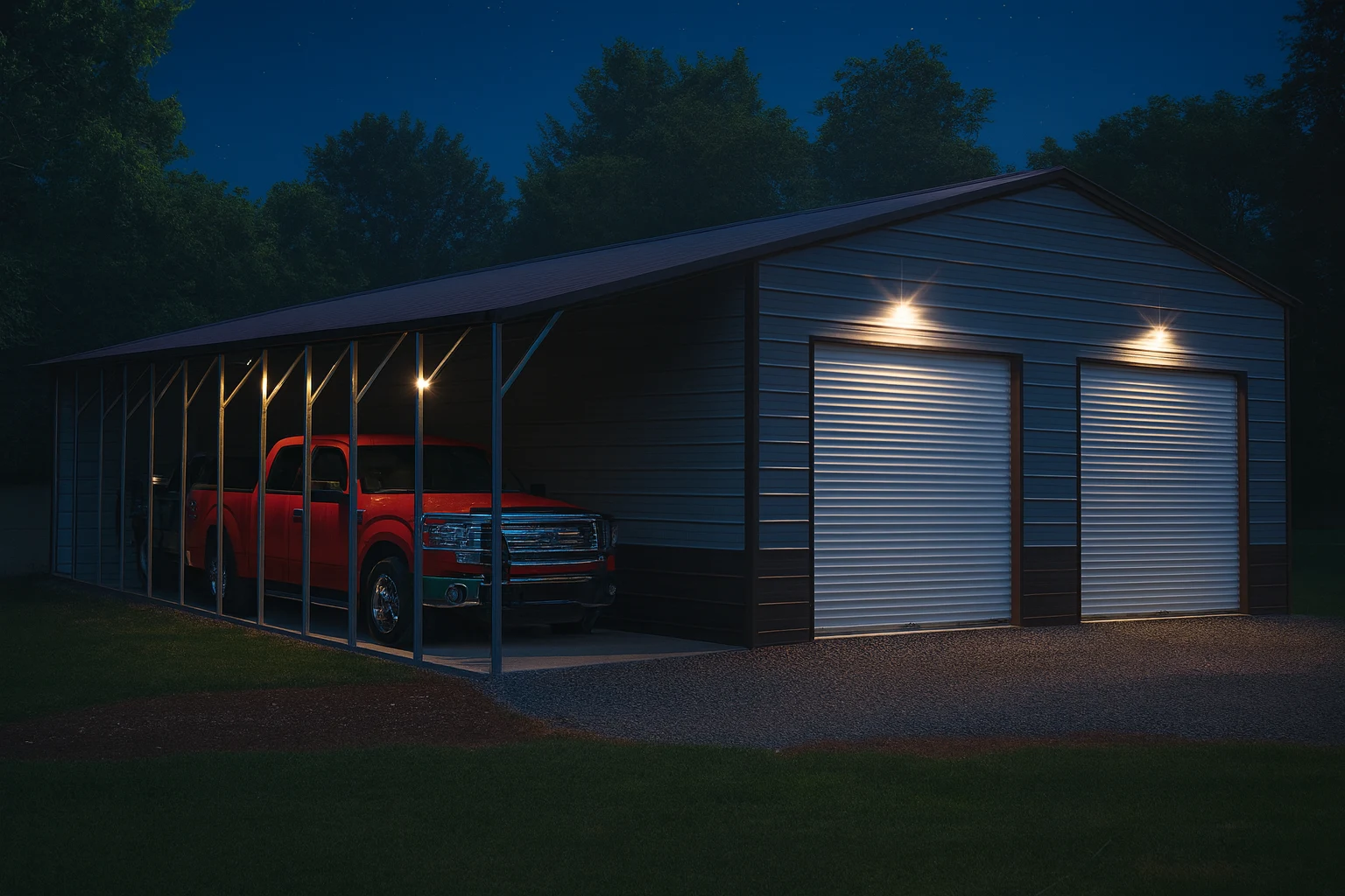
Two-tone with wainscot. Light walls above, darker wainscot below, trim matching the wainscot. Reads as designed rather than default, and hides the splash and dirt line that accumulates at the base.
Monochrome with contrast trim. Roof and walls the same color, trim in a strong contrast. Clean and modern. Works well on commercial buildings.
Barn red or classic combinations. On rural property, traditional pairings look right in a way modern palettes don't. Context matters more than trend.
Combinations to Avoid
- Three or more strong colors. Busy reads as cheap.
- Dark walls on a large building in a hot climate. Heavy visually and hot inside.
- Trim matching the walls exactly. Edges disappear and the building looks unfinished.
- A color scheme that ignores the house entirely when both are in the same view.
Decorative Options Beyond Color
Wainscot. Covered above. Inexpensive and effective.
Gable end treatments. Closing and trimming the gable ends changes the profile substantially, especially on carports.
Roof pitch. Not a color choice, but the most powerful appearance decision you'll make. A steeper pitch reads residential; a shallow one reads utility. See roof pitch.
Windows. Placed symmetrically, they transform how a long wall reads. Scattered, they don't. See adding windows.
Door style and color. Contrasting doors become a feature. Matching doors disappear into the wall. Both are valid — pick one deliberately.
Overhangs and eaves. Even a small overhang casts a shadow line that makes the building look built rather than assembled.
Cupolas and dormers. Traditional on barns, and effective at breaking up a long roofline.
Order of Impact
If you're prioritizing, this is roughly the order in which choices affect how the building looks:
- Roof pitch
- Roof color relative to the house
- Wainscot
- Trim contrast
- Window placement
- Overhangs
- Door color
The first three do most of the work.
What This Costs
Color choices within a standard palette generally cost nothing — you're picking from options, not adding them. Custom color matching costs more. Wainscot and trim upgrades are modest. Overhangs, steeper pitch, and gable treatments are real line items.
The good news is that most of what makes a building look good is free. See metal building cost for what actually drives price.